
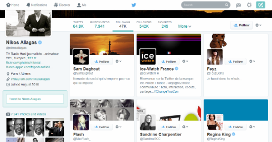
Was testing previously, and it was announced on Tuesday that Twitter is gradually rolling out their new profile page design. Hm…the new look somewhat looks similar to a Facebook’s profile page. Looks quite nice actually. With the new design, not only the profile & header images were bigger, the contents area seems to be bigger too. I liked the new profile image size. There are times when I look at other users’ profile page and really find the current profile image too small, cannot see clearly…ha ha ha… “Who to Follow” and “Trends” moved to the right in the new design. And if you are in “Photos/Videos”, “Following”, “Followers” and “Lists” sections, they moved to the lower left position.
There’s already some live profiles with new design and here’s some screenshots found in Twitter’s blog:
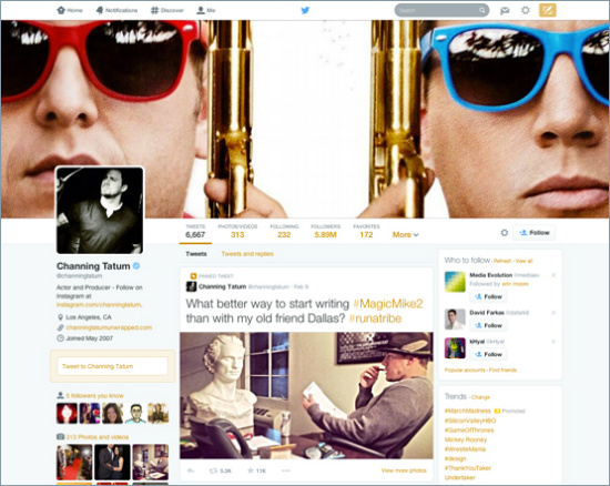 Not too bad, isn’t it? But I wonder how much I can customise with the new design.
Oh, I happened to click on the “Following” link and realised that it’s totally different from what I am having now, ie. a list of users, whereas in the new layout, it’s in grid layout or pinterest-lookalike. Hm…I wonder which is more user-friendly. Wait till I see mine.
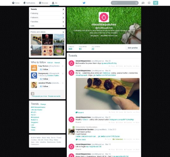
I haven’t get to see mine yet, but quite looking forward to the change… New users will start using the new design, whereas the existing users will be changed in coming weeks. Before it’s changed, I better keep a copy of my old profile page…he he ehe…
– ♥ –